
How to use responsive resizing in Adobe XD
Jul 25, 2022Just a few short days ago, Adobe XD released the new September update which includes responsive resizing, timed transitions, and spell checking.
The first of these 3 is by far the one I’m most excited about.
Auto Responsive Resizing
Now Sketch, Figma, InVision Studio and others already have responsive designers so it was not surprising that Adobe XD was working on this but many might have been wondering why it didn’t come sooner.
Well, Adobe didn’t want to do a responsive design like all the other tools. Their approach was to make this as automatic as possible doing 90% of the work for you and freeing up chunks of your time for more rapid design.
Using the Auto Responsive Resize, you just toggle with and almost your entire design is constrained to the appropriate corners, edges, and sizes. Now Adobe can’t anticipate all your responsive needs so as you stretch your design, you might find an element or two out of place. It’s very simple to bring these guys back in line by either grouping them with other elements or setting them to manual responsive resize and setting the constraints similar to how you would in Sketch or Figma.
Here’s a quick video demonstrating Auto Responsive Resize:

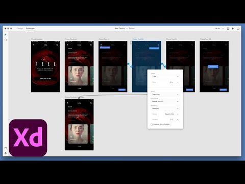
Timed Transitions in Adobe XD
Now timed transitions are probably just as exciting for some as responsive resizing and this is another new feature Adobe Announced. You can design overlays or app tips that are triggered after a certain time and you can even create time-loops that toggle between artboards based on a duration you set.
Here’s a video of timed transitions in action:
Don't miss a beat!
New moves, motivation, and classes delivered to your inbox.
We hate SPAM. We will never sell your information, for any reason.
